TheOdinProject.com Redesign Part I: Goals (and Loving Thy User Experience)
The Odin Project is a free online curriculum for learning web development with Ruby on Rails. It stitches together the best existing content into an opinionated and straightforward path for going from total novice to hireable as a junior developer.
I recently overhauled http://www.theodinproject.com to turn the website from the barest minimum into the kind of platform that can support a meaningful user experience and grow over time.
Because the project is founded on the belief that transparency and openness facilitate learning, in this two-post series I'll walk through the decisions behind the redesign and the tactics and trade-offs that were a part of its implementation. You can view Part II here
The Old
The Odin Project started from some pretty darn humble beginnings -- it originated as a collection of Markdown files about web development on Github and a splash page that linked to them:
theodinproject.com in August 2013:

The Curriculum on Github:

Needless to say, the user experience was a bit clunky. People who stumbled into the curriculum often couldn't figure out how to navigate between the files using the hard coded hyperlinks I provided. At that point in the life of the project, the major question was just whether anybody cared enough to make it worth pursuing and so the bare bones pages were good enough.
Luckily, there are apparently a lot of people who want to learn this stuff and it made sense to keep the project moving forward. So I began adding elements, including an open login so students could access a scheduling tool that allowed them to pair program together and a forum for posting questions.
We entered Phase II:
theodinproject.com Homepage in October 2013

To make the curriculum easier to navigate, I converted the static files on Github into a Jekyll page hosted by Github Pages at theodinproject.github.io (and linked to from the main website using the subdomain curriculum.theodinproject.com).
Jekyll is a nice tool that lets you create basic content-driven websites by using static content files and some template files for formatting and organization, all of which are stored in your Github repository. Github lets you host these for free on your project's subdomain at yourproject.github.io. The curriculum looked like this:
curriculum.theodinproject.com Jekyll Site in October 2013:

The Issues
This design was good enough to validate that people were interested in the project but there were some major issues that needed help:
- A visitor to the homepage was given FOUR options to choose from, including checking out the curriculum or signing up. Straddling the line between several possible user paths only reduced the effectiveness of the experience.
- Similarly, there was no obvious "path" for the user to take within the curriculum... it still felt like a bunch of files and an index, not a journey. I wanted the project to be a focused experience, not just a collection of useful files.
- Related to that, there was no obvious "next lesson" to head to once the current lesson was finished... the user had to know where they were in the navigation and to click on the next one manually. Yuck!
- You'll also notice that the curriculum (hosted by Github) was separate from the main website (hosted on Heroku) -- users would have to jump to a new subdomain to get to the curriculum. I did the best I could to make them seem the same (the navbar was styled identically) but they weren't the same website. There are good and bad aspects of this design decision. On the positive side, it was quite easy for students to contribute to the curriculum by submitting pull requests directly to the Github repo, which has been one of the project goals from the beginning. Unfortunately, logged in users had no way of tracking their progress through the curriculum since their login occurred on a completely separate subdomain. That severely limited how much flexibility there was for new features.
- Another side effect of this same issue is that, while I could get back some basic Google Analytics about user behavior, I still didn't really know how people used the site at all. It felt like I was operating in a data blackout, which is pretty much a data geek's worst nightmare.
- The content, which provides a lot of rich text-heavy explanations, had tons of SEO potential but little of that was being optimized.
I wanted the project to support anyone who showed up out of the blue, not just a select few motivated students who attended our weekly Meetups and could power through its inadequacies. These inadequacies and a host of others pointed to one fact: A major overhaul was needed.
User and Business Needs
With some help from the excellent UX designer Katherina Nguyen, I clarified the high level goals of the project and how the user experience needed to evolve to accommodate them.
User Goal: Take the (Prospective) Student on a Journey
The most important factor in building a great user experience was clearly to provide a focused journey for the student to take through the content, starting from the homepage and ending with the last lesson. That would solve many of the problems with the existing site, as identified above.
New Visitors
Clarifying that goal immediately forced a decision about whether to emphasize signing new visitors up (to "lock them in" as students) or funneling them directly into the content (to get them learning ASAP). The existing site sort of straddled the line, providing both as options on the home page.
Between the two options, funneling new visitors into the content as quickly and easily as possible made the most sense because The Odin Project has a content-driven value proposition and getting the potential student to the good stuff easily is the best way to give him or her a great experience. There really wasn't a good business or user case for trying to target sign-ups at this point.
This meant that the main content had to be just one click away from the landing page... no hiding anything behind a login. The prospective students would also need to be properly prepared and motivated for what they were about to dive into, which meant providing informative copy and calls-to-action throughout the process.
Existing Students
Getting prospective students to check out the content was just the first step in a good experience. It would also be important to keep them engaged in their learning journey over time. The most important part would be structuring the content in a way that clearly emphasized the student journey and then supporting that expectation throughout the website via copy and presentation.
This would really be the bare minimum necessary to start providing a coherent student journey. In order to support the certain development of features in the future, the curriculum would have to become a platform that integrated with the user logins and other secondary functions. The student experience would have to become one. The curriculum would need to be taken under the main website's umbrella.
Business Goal: Collect Better Data
I also identified a few goals from the perspective of the website owner which were related to the previously-mentioned issues with the existing site.
I really wanted to understand my students' behavior better so I could more effectively improve their experience and grow my user base through more effective marketing. This meant focusing on improving analytics coverage, which would provide a critical backstop to the qualitative customer development conversations I'd been having all along. In particular, the ability to track visitor cohorts through iterations of product would be critical. If you can't measure it, it didn't happen!
In addition to improved analytics firepower, I wanted to make sure the content could be readily indexable by search engines. Luckily, search engines have gotten pretty good at surfacing well organized and accessible content, so SEO gains would be a pleasant side-effect of improving the user experience and content organization.
Finally, I discussed above some of the considerations for whether to emphasize student signups (by hiding content behind a login) or immediate content consumption (no login required) on the home page. From the site owner's perspective, it was a choice between collecting a rich set of data from a smaller user base (those who actually signed up) or a larger quantity of data from a more anonymous user base (for visitors who just dove into the content right away).
Luckily, some students had actually been signing up anyway (without technically needing to or being directed to) and I expected this behavior to continue so I was actually able to get both datasets anyway. The benefits of making the content freely available well outweighed the loss of potential signups from not implementing a required login.
Scoping and Wireframing
With the goals of the redesign laid out, it was time to start brainstorming how to accomplish them. It was pretty exciting to know that I'd finally get to have all the site's content "under one roof" (on the same domain), so it was a blank slate from which to design.
I took a look through the user flows of several comparable sites to gain inspiration. Massive course providers like edX, Coursera, Udemy and Udacity all had similar layouts which encourage you to dive into specific courses straight from the homepage. I also compared with more text-based interfaces like e-books because I didn't have the resources to produce a full-on course experience.
####Edx:

####Udacity:

####Udemy:

Curriculum Pages
I quickly realized how important it would be to have a strong and clear organization of data. Remember... most of the files were scattered throughout the Github repo at this point.
This is the same approach espoused by the design hierarchy pyramid, which emphasizes the reliability, speed, organization and structure of a site over the interactions and aesthetics. In my case, it made the most sense to reorganize the curriculum into a straight path through seven courses, each of which contained its own lessons and projects (grouped by section). This seemed like the best compromise between being shallow enough to allow easy browsing but deep enough to provide meaningfully small groupings of content.
For the visual display, I didn't have a lot of design resources at my disposal, so I stuck with a clean but text-based index organized around principles of visual hierarchy. It emphasized the path forward by providing the potential student with a look at the road map and previews of all the content that would be covered by a given course or lesson. The color palette was expected to be very simple and designed to draw focus to the path and the projects by coloring them separately.
Courses Index Mockup:

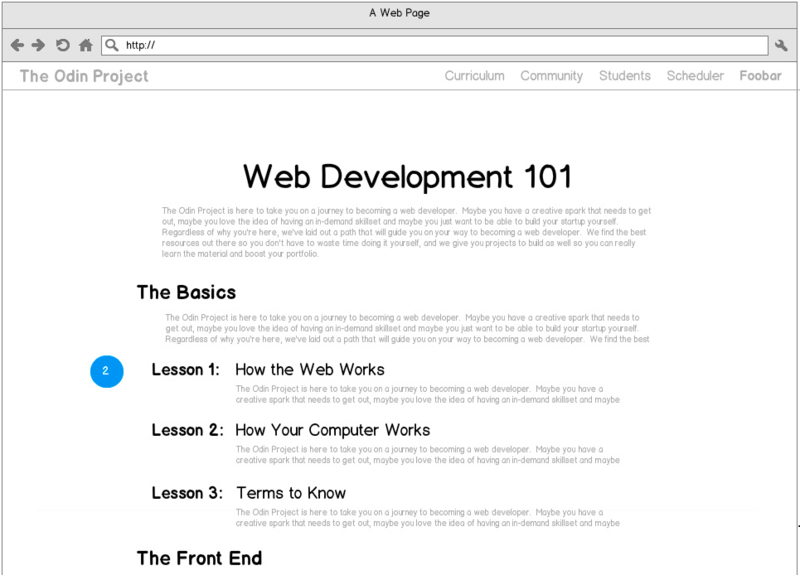
Lessons Index Mockup:

The "old" site had more than emphasized the need for clear and available navigation. It's important to show the user where they are now and where they should go next, so I designed a simple and lightweight breadcrumb nav that would sit unobtrusively atop each lesson. Each lesson also needed a linear path to the following lesson or project, so I put in an unmistakable button at the bottom for heading to the next lesson (as well as options to return to higher level menus).
Single Lesson Mockup:

Home Page
The home page needed a clear and strong call to action right off the bat but also had to provide enough background for the users who wanted to scroll down and learn more first. I opted to split the CTA into two separate buttons as an experiment to see how many people were interested in starting from square one (the "Learn What a Web Developer Does" button) versus those who would prefer to browse the curriculum index (the "Explore the full curriculum" button).
When landing pages have a fair bit of content, a nice technique is to split it into different sections with horizontal bands, so I opted to use this technique. I also made sure to include a healthy dose of graphical elements, since they would be much more critical here (as generators of interest and attention) than the lesson pages (when the visitor was theoretically already sold enough to go looking for deeper information). Graphic elements are almost always a good thing, but I was operating with limited resources.
For the home page's content, I struggled to balance keeping things clean with providing a full explanation of the project. I decided to stick with just the highlights and, again, tried to tell a story of the user's journey instead of just talking about the project itself. What I did include about the project was geared more towards making the visitor feel good to be a part of it than explaining all the details.
To support this, I decided to break out a lot of the project exposition into separate "about" and "FAQ" pages. This had the added benefit of prompting me to pull out many links from my overcrowded top navigation bar into a much less obtrusive footer.
Home Page Mockup:

Look and Feel
The initial website had relied on a very Bootstrap-heavy look that I quickly fell out of love with. For the new site, I favored simplicity and legibility, emphasizing large sans-serif fonts and flat design where possible. I wanted to focus on maintaining an appropriate visual hierarchy and not on making lots of "pretty" design (again, hearkening back to the design pyramid). That means the color scheme is very simple, mostly almost-black and white. It's meant to avoid distraction from the content.
Looking Ahead
In this post I covered the humble roots of the project and how the design of the old website needed to evolve in order to meet user and business needs as it grew. In the next post (view Part II here), I'll dive into how I turned those needs into a finished and shipped website.
If you have thoughts or comments, please feel free to send them to contact@theodinproject.com.