TheOdinProject.com Redesign Part II: Turning Pretty Mockups Into Code
The Odin Project is a free online curriculum for learning web development with Ruby on Rails. It stitches together the best existing content into an opinionated and straightforward path for going from total novice to hireable as a junior developer.
I recently overhauled http://www.theodinproject.com to turn the website from the barest minimum into the kind of platform that can support a meaningful user experience and grow over time.
Because the project is founded on the belief that transparency and openness facilitate learning, in this two-post series I'll walk through the decisions behind the redesign and the tactics and trade-offs that were a part of its implementation. Find the first post here.
Getting Started
With the redesign goals laid out and the wireframes put together (see Part I), the needs of the users and the site owner were represented and it was time to move towards actually building it.
When viewed in aggregate, the full site redesign was really two almost completely separate parts — the curriculum redesign and the homepage/nav redesign. The curriculum redesign was by far the bigger task since it would require building almost completely new back end infrastructure while the homepage/nav redesign was more focused on design elements and could be pushed off if absolutely necessary (since there was an existing homepage).
User Stories
I wanted to follow as much of an Agile development methodology as I could, though some aspects could be short circuited since I was working alone. I love the organization and user focus that Agile brings to the process. You can read about Agile Development here.
The first step was to break the wireframes into pieces. There's a great Balsamiq blog post on the subject. In this case, the scope of the project was so large that the wireframes first had to be broken into larger features, which I decided to call epics (even though many of them aren't really beefy enough to warrant the designation):
Curriculum Redesign Epics
- The user should experience identical site look-and-feel and logged-in status while viewing the courses and lessons.
- The user should be able to move from one lesson to the next in order.
- Display a single lesson or project (including its "Next" button).
- Display an ordered list of the lessons in a course with descriptions.
- Display an ordered list of the courses in the curriculum with descriptions.
- Display the navigation breadcrumbs for lessons and course lists.
Homepage/Nav Redesign Epics
- Make URLs more descriptive.
- Clean up site-wide navigation
- Add static pages (e.g. About, FAQ, Contact)
- Make the home page
With the epics laid out, each had to be broken down into specific actionable user stories for development. In the following sections I won't get into too many individual stories (due to space limitations), but will illustrate some of the implementation decisions that guided their development.
Building the Curriculum Redesign Epics
Before diving into specific user stories, I had to figure out the high level architectural strategy for building out the curriculum. There's a bit of a chicken-and-egg problem sometimes where your architectural decisions, which are based on the stories, inform what's actually possible with the stories.
The biggest hurdle here was figuring out how to bring the curriculum into the main theodinproject.com website (remember, it had been running on the subdomain http://curriculum.theodinproject.com and statically served using Github Pages). I still wanted students to be able to submit pull requests to the original curriculum repository so I decided to use the Github API to grab those Markdown files for rendering in the lesson view.[1]
The requirement that lessons (and courses) maintain continuity, i.e. that the user could see them listed in order and move easily between each lesson and the lesson on either side, was the next most important. I could have just hard coded the order of the lessons and hard coded the link for the "next lesson" into each one… but the very thought of that option made my inner engineer break a bottle and hold it menacingly against my hippocampus so it passed quickly.
I opted instead to create each course, section and lesson as a separate database object. It ended up being almost as much effort as the hard coding solution but was much more modular and extensible for the future.
Course and Section objects only needed to have simple meta information like title and description and a position attribute so they could be sorted. Lesson objects also needed the link to the Markdown file on Github and a text column for the content. I decided to use a rake task to cycle through the lessons and update their content from the files on Github when necessary.
To populate the database (and to make it easier for anyone else working on the project to populate their own databases), I decided to write all the actual attributes for each Course, Section and Lesson in the db/seeds.rb file.
Once the conceptual heavy lifting was done for setting up the data structure, it was relatively easy to break apart the work load into specific stories and tasks that needed to be completed. I built them out in approximately the same order they'd been tackled conceptually.
Building the Homepage/Nav
Turning the homepage/nav epics into stories and writing the markup was a straightforward process. I collapsed the overcrowded navigation bar into only two options (with a dropdown for logged in users) and created simple About, FAQ, and Contact page links on the footer. Laying out the home page was straightforward as well.
Old vs New Navbars:

Navbar Flyout Menu for Logged In Users:

Footer:

Finalizing the design elements and styling got much trickier. Many of the macro scale design decisions had been made during the original wireframing process but determining basic element placement in a mockup is a far cry from realizing that design.
I originally expected to be able to build my own icons in order to achieve a more consistent visual feel over the whole homepage. That turned out to be too much ground to cover so I eventually opted to stick with mostly clip art and stock photos. That created some problems with consistency across the visual hierarchy so I had to wrangle element positions a bit more than I originally expected.
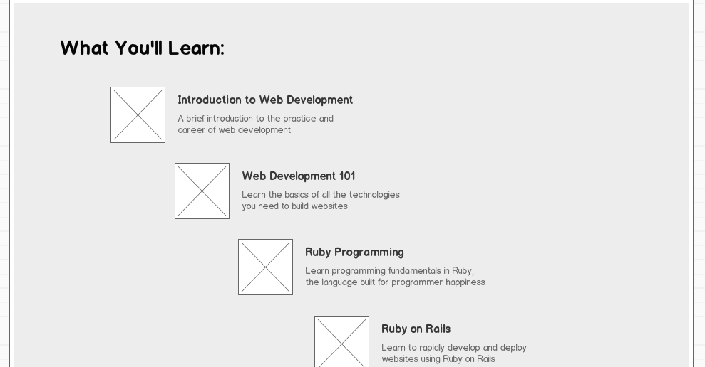
It was also important from the beginning to make the site functional (if not seamless) on mobile. In this case, that meant using a mostly fluid mostly symmetric layout and adding media queries where necessary. The original wireframes don't quite match the end result because of some of the compromises I had to make between the original vision and the realities of implementation with limited resources. This is especially apparent in the "What You'll Learn" section, which started life as a diagonal cascade from left to right but couldn't be made to maintain visual consistency across screen resizing.
"What You'll Learn" Homepage Section Mockup:

"What You'll Learn" Homepage Section in Production:

Making URLs More Descriptive
The Rails default convention is to put the resource ID into the URL, e.g. http://theodinproject.com/courses/1/lessons/3. I wanted to instead use descriptive URLs like http://theodinproject.com/courses/web-development-101/lessons/ruby-basics. It was pretty straightforward to achieve, involving simply changing the controllers to use descriptive titles instead of IDs for locating courses and lessons.
I also wanted to make things easier on users who were manually typing in the URL and might accidentally type something like /courses/web-development-101 instead of /courses/web-development-101/lessons when they wanted to see the web dev 101 lessons. Fixing this was a bit more complicated because it required redirecting parameters. This required a touch of routing judo:
# config/routes.rb
...
get 'courses' => 'courses#index'
get 'courses/:course_name' => redirect('/courses/%{course_name}/lessons'), :as => "course"
...
Applying the Analytics Layer
You'll recall that the site-owner goals of the redesign also included being able to better measure visitor and student behavior. Much of that is handled by the standard Google Analytics tracking snippet but some changes needed to be made to help that along. I added referral parameters to some of the links and buttons on the various pages so GA would catch them and I could better determine site flows, user intent, and goal completions (e.g. signups).
This was really the bare minimum analytics coverage to get started with, but I knew I'd be able to set up a more robust coverage once the site went live and I started getting initial indications about behavior.
Miscellaneous Stories
A few additional stories made their way into the queue as well.
Part of building a strong user experience was putting together a welcome email that helped new users get oriented before starting their new journeys. That looks something like this:
Welcome Email:

To help people find the site via search engines, I set up a simple sitemap.xml route to output a dynamically generated (and correctly formatted) listing of all the pages on the site so it could be easily crawled. I submitted it to the major search engines once the site went live and it made a big difference in search referral traffic. See this Stack Overflow post for suggestions about making sitemaps.
Another easy SEO win was making the lesson pages use #content_for to hand off lesson-specific title strings instead of always using the generic The Odin Project title.
It's Live!
The deployment process is somehow never error-free, but the site went up at theodinproject.com without too much headache and got some much appreciated kudos from existing users. It's incredible what a difference it made to get content properly ordered and presented. We've increased user numbers slowly but surely as more people find the site and their feedback has been incredibly useful for informing the future development of the platform.
Homepage
The New Homepage:

…Compared to the Old Homepage:

Curriculum Content Pages
The organization of the courses and lessons pages is also a vast improvement over what we had before.
The New Courses Index:

The New Lessons Index:

A New Lesson Page:

…Compared to the Old Curriculum:

Next Steps
The redesign leaves The Odin Project in an exciting place. Not only do visitors now have a clear path to becoming students, but the curriculum is finally housed on the main website and that opens the door to a host of exciting possibilities. It allows us to finally build features that unify the curriculum with the experience of using the website. Over the next weeks and months we'll be leveraging the new platform by putting together ways for students to track their progress through the curriculum and ultimately to collaborate with each other.
I hope that seeing how it all came together will help you think about weighing trade-offs between user needs, business needs, and engineering realities in your next project. If you'd like your next project to be The Odin Project, check out our "Getting Involved" document on Github. We've already started taking advantage of the new site to allow students to develop on it themselves, which will be the subject of future posts.
Good luck and happy coding!
If you have thoughts or comments, please feel free to send them to contact@theodinproject.com.
Footnotes:
[1]: The original implementation actually just served those files directly from Github via the API but I ultimately decided to store their content in the main database to avoid rate limit issues.